
What Is the 'Golden Cross,' and Why Are Bitcoin Investors Obsessed With It?
Money is not a client of any investment adviser featured on this page. The information provided on this page is for educational purposes only and is not intended as investment advice. Money does not offer advisory services.
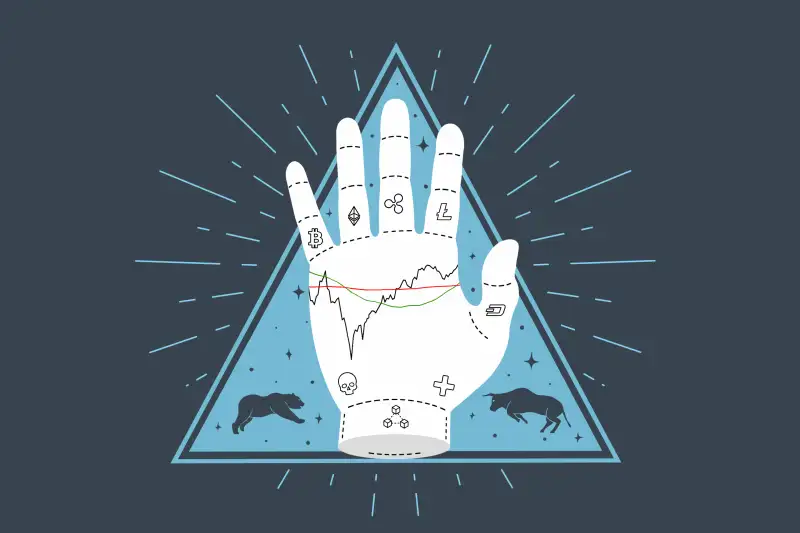
For many Bitcoin investors there’s nothing better than looking at a price chart and seeing the vaunted “golden cross.” At the same time, its dark twin, the “death cross,” can strike fear into the YOLO-est of hearts.
While cryptocurrency is new, studying price charts — looking for patterns in graphs of up and down movements — is one of the oldest (and oddest) trading strategies on Wall Street. It’s also one of the most controversial, with advocates swearing price patterns contain valuable information, but many others dismissing the practice as investing’s equivalent to tarot cards or astrology.
Whatever you think of so-called technical analysis, investors can't ignore the hype around a pattern that’s forming on Bitcoin charts called the “golden cross.” Chatter about the indicator on specialist Web sites such as CoinDesk and Cointelegraph could catalyze more upward momentum, if only as a self-fulfilling prophecy.
Cryptocurrencies “trade extremely technical because what else are they going to trade on?” says Mark Arbeter, who publishes a newsletter analyzing the charts of a variety of indexes and securities. “You can’t pick up an annual report, a quarterly report...any kind of freaking report and do a fundamental analysis of this stuff.”
What is charting?
Ever since Charles Dow compiled the Dow Jones Transportation Average in 1884, investors have sought to decipher broader trends in financial markets by charting prices and other indicators such as trading volume and price moving averages. Based on these indicators, technical analysts draw trend lines over price charts in an attempt to identify turning points. These points are broadly categorized as "support," spots where bounces tend to happen during selloffs; "resistance," spots where rallies tend to peter out; and "breakouts" or "breakdowns," spots where momentum should accelerate in one direction or another.
The most widely tracked chart trends in cryptocurrencies are moving averages, momentum indicators, “which basically measure the speed of the up-trend or the down trend,” says. Arbeter. There are simple and exponential versions of moving averages, with the latter giving more weight to recent prices. But the concept is the same: Take the daily prices of a security, index, commodity, or digital currency over a chosen period, add them all up and divide by the number of trading sessions.
How the golden cross/death cross is supposed to work
The chart lines tracking moving averages that form both the bullish “golden cross” and the bearish “death cross” trace the simple 50-day and the 200-day moving averages of a stock or cryptocurrency over an extended period of time.
“The death cross,” recorded by Bitcoin in July, indicates that the short-term trend — expressed by the 50-day moving average line — had accelerated downward by crossing below the long-term trend line, the 200-day moving average. This event was supposed to herald a breakdown of the long-term upward trend that began in March 2020. (As it turned out, Bitcoin began a new rally in late July.)
The golden cross is the bullish flipside, and happens when the 50-day moving average breaks above the 200-day moving average. Bitcoin was on the cusp of recording a golden cross as recently as Sept. 6, when, according to crypto Web site CoinDesk, the 200-day moving average was around $46,100 and the 50-day was about to move above that, following a string of closes above $50,000. As it happened, Bitcoin prices retreated the second week in September. It would have been the first time the golden cross has happened on a bitcoin chart in more than a year, suggesting a break-out to a more dramatic rally, according to technical analysts.
Does the golden cross really work?
There are so many traders and algorithms, following the 50-day and 200-day moving averages on the Standard & Poor’s 500 that there’s almost always a market reaction -- a series of rebounds in bear markets, or a series of short-term corrections in bull markets -- when either one is tested, says Arbeter, who has followed stock charts since he started on Wall Street the week before the crash known as Black Monday, October 19, 1987.
“If you go back in time 100 years and look at uptrends in major indices, you’ll see the 50-day worked even back then…it’s just something that people pay attention to,” says Arbeter.
On the wild bitcoin chart, however, the indicators are less reliable, Arbeter says. The "death cross" in July marked the end of the downward trend rather than an intensification of it.
For newcomers, the golden cross could still be a reassuring momentum signal, says Edward Moya, senior market analyst at OANDA Group, which specializes in another market where charts carry a lot of sway — foreign exchange. Moya would see a move of the 50-day moving average above the 200-day as a signal that short-term upward momentum is strengthening, reducing chances of a sudden collapse in the short term.
“With bitcoin, where you could see 20% plunges out of nowhere, and extreme drawdowns of over 50%...the golden cross pretty much alleviates the concerns that you're trying to catch a falling knife during one of those panic-selling frenzies,” says Moya.
More from Money:
Robinhood for Beginners: A Complete Guide to Investing With the Controversial Stocks App