S&P 500, Nasdaq Display Ominous 'Death Cross' Patterns

UPDATE, April 15 at 10 a.m. ET: As of Tuesday morning, both the S&P 500 and Nasdaq have displayed the death cross pattern on their respective one-year charts.
The Dow Jones Industrial Average — which showed the pattern when this story was first published — has since removed the pattern, but its 50- and 200-day moving averages are just 0.64% apart, suggesting that a death cross could materialize for all three of the major indices in the coming days.
Below is our original story.
Last week's record-setting stock sell-off has compounded the major indices' year-to-date losses, increasing the risk of a full-fledged bear market and giving rise to concerns about an unwelcome chart pattern.
Driven by President Donald Trump's "Liberation Day" tariff announcements, a combined $6.6 trillion in value was wiped out of the market last Thursday and Friday. Now, both the S&P 500 and Nasdaq are on the verge of what's known as a "death cross." (The Dow Jones Industrial Average has already displayed the pattern, as have a number of Magnificent Seven stocks.)
Technical analysis is not an exact science. Many of the tools it relies upon are lagging indicators, meaning they are based on past performance. But historically, a death cross is accompanied by notable bearish price movement in stock prices. Although a bear market is technically indicated by a loss of 20% or more from a recent high, this pattern has accompanied some of the most severe market downturns in history.
Before delving into the death cross' mechanisms and what it could mean for your portfolio, investors must first be aware of how another indicator — a simple moving average — works.
What are simple moving averages?
Simple moving averages (SMAs) are one of the most popular and easily understood technical indicators. An SMA represents the average price of an index or a security — be it a stock, exchange-traded fund (ETF) or mutual fund — over a certain period of time. It's displayed as a line that moves along a chart, changing in value as the price of the equity or index changes.
If the SMA is moving up, the underlying price is trending upward. If the SMA is moving down, the underlying price is trending downward. Therefore, SMAs can be used as a gauge of bullish or bearish momentum over any given period.
The most commonly used SMAs are the 50- and 200-day moving averages, which often accompany one another on stock charts due to their interconnectedness. The former is used to gauge short-term trends, whereas the latter is used to gauge long-term trends. For instance, when a stock is showing its 50-day SMA above its 200-day SMA, it is indicative of bullish price movement. Conversely, when the 200-day SMA is situated above the 50-day SMA, it suggests bearish price movement.
This is critical in understanding how a death cross pattern forms — and, more importantly, what it implies for stock prices.
Death crosses signal the start of bear markets
When bullish momentum begins to subside and sellers start outnumbering buyers, the gap between the 50-day and 200-day SMAs begins to close. As those two lines draw nearer on a stock chart, there is correlated price movement to the downside.
Subsequently, if the 50-day SMA crosses under the 200-day SMA, it forms the death cross chart pattern, which typically indicates the transition from a bull market to a bear market.
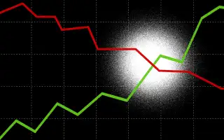
As demonstrated in the following one-year chart of the tech-heavy Nasdaq, the index is on the brink of displaying that pattern. As the price (red) begins to fall, the 50-day SMA (blue) begins to approach the 200-day SMA (green). When blue crosses beneath green, a death cross will form:
Once a short-term SMA moves beneath the long-term SMA, extended losses over a longer period are expected. According to fintech firm SoFi, the death cross has helped predict some of the worst bear markets in the past 100 years, including the Wall Street crash of 1929, the Roosevelt Recession of 1938, the oil embargo-fueled crash of 1974 and the global financial crisis in 2008.
At the time of writing, the divergence between the 50-day SMA and 200-day SMA was just 0.82% for the S&P 500 and 0.2% for the Nasdaq. It looks increasingly likely that both of those indices will soon be joining the Dow in showing a death cross.
More from Money:
'Anything Works in a Bull Market.' But What About a Bear Market?
Can Skipping Avocado Toast and Lattes Really Help You Buy a House?