
How Other Countries Help the Blind Tell Money Denominations Apart
For all the talk about impending changes to the $10 bill, there's one group that's particularly interested: the blind and visually impaired. The new bill will be the first that allow blind people to distinguish one denomination from another—something they now can't do, since all U.S. paper currency is the same size, shape, and feel. "Only two major currency-issuing authorities issue notes that do not vary in size by denomination—Canada and the United States," a Fed study reports. However, Canadian bills, unlike U.S. banknotes, feature tactile marks that allow the blind and visually impaired to tell bills apart by touch.
Though blind people have figured out workarounds, such as methods of folding bills to tell them apart, challenges around currency have long been an issue; the Treasury Department was even sued over it in 2002. Technology has made task somewhat easier, with phone apps that can identify bills, and the Bureau of Engraving and Printing’s free iBill scanner.
Other countries are way ahead of the United States on this front, however. Most accomplish the currency differentiation by size, while others include features such as Braille or other raised markings on notes.
Unfortunately, "the first note with a tactile feature will not likely be issued before 2020," the Bureau of Engraving and Printing estimates, mostly due to the fact that it will be be costly to implement.
Seeing as October 15 is Blind Americans Equality Day, we thought it would be appropriate to show eight currencies used in countries that actually understand that blind should be able to use cash as easily as everyone else.
Read Next: New $10 Bill Will Feature a Woman
Australian Dollar

The Australian dollar tackles the accessibility issue in a very simple method, by making larger denominations not simply larger, but longer. They also have strong colors and contrasts for the visually impaired.
Euro

The Euro banknotes were designed with heavy input from Blind organizations and have a very simple distinguishing feature: big bills are big; little bills are little. The notes have some intaglio printing, which gives them relief marks that can be felt. The €200 and €500 bills have special tactile marks on them as well, for added security and assuredness when dealing with such large amounts.
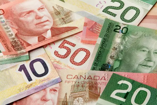
Canadian Dollar

Canada is the only other major currency other than the U.S. with banknotes that are all the same size. But our northern neighbors have built in tactile marks at the top right of bills. Like most other currencies, different denominations are colored differently to aid the visually impaired too.
Hong Kong Dollar

Hong Kong's very cool currency—yes, that is a lion—has three of the hallmark features typically seen: intaglio printing, different sizes, and different colors. Nobody is mistaking a 1000 for a 500.

Swedish Krona

There's a clear pattern to what works here—Sweden has different colors for the visually impaired and different sizes for the blind. Really, they're useful to everyone though. Everyone has probably mistaken a $10 for a $1 at some point.

